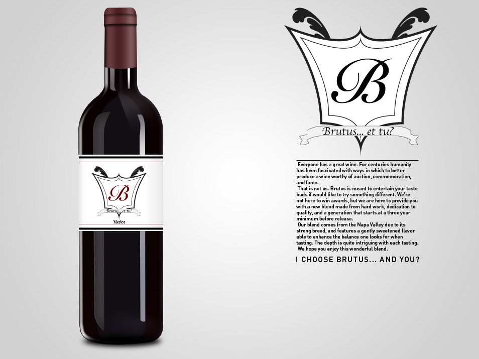
I love both the elegance and strong design with wine logos and so I wanted to give it a try. Part of my goal was to give the logo a history and story, and somehow I ended up going with the story of Cesar and his beloved friend Brutus. Wine tends to remind me of high-class drama extended through centuries of families and stories and that no matter what there is always a form of betrayal on a royal scale/level. Thus I made the name of the wine Brute with a family crest that some wineries use. The red “B” on a black label is somewhat indicative to the idea of red in the movie The Sixth Sense by M Night Shyamalan; red stands out in any situation and hints that something is off about the red object within the rest of the environment.
Next to the bottle, under the main logo, is a stylized description of the wine and provides the reader a bit of entertainment. I feel that elements like this help make the experience of the wine better and gives the customer a better sense as to what the company is like; fun, cultured, knowledgable.

Leave a comment