The main point of this design was to be up front and display exactly what the customer was purchasing. The two sides would be on the oposite sides of the box, while the center being the main focus and callout as to what the product is. This is a very vibrant update meant to both turn heads as well as bring attention to the product. All three versions kept the same color value to help with continuity.
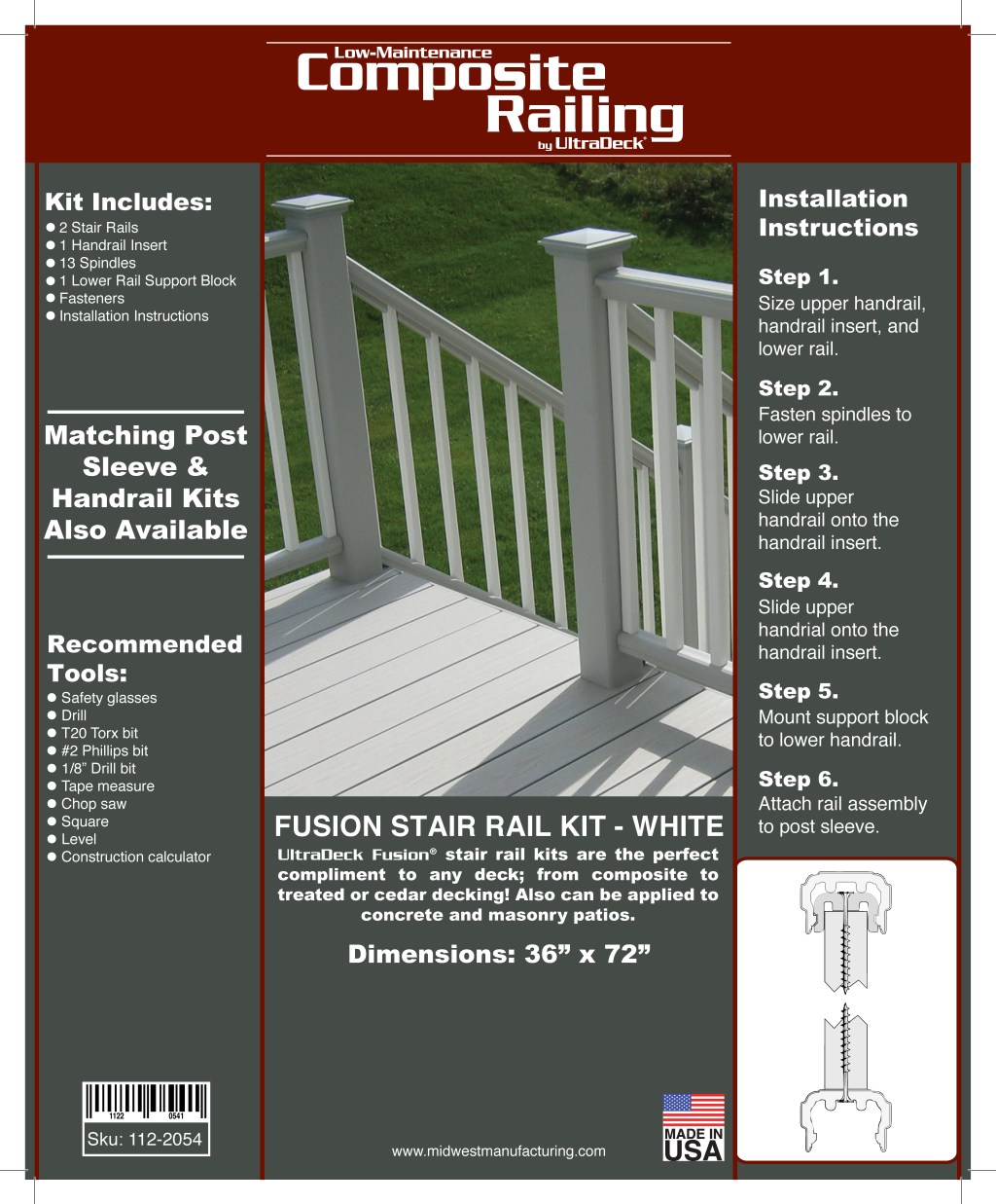
To help show how easy the product is to install, the client wanted to place the instructions on the side of the box. This did create some difficulty since I wanted to avoid having many breaks per step. My solution was to update the copy and create a bit more instructional/technical format of writing to save space and be more direct in instructing users.

Leave a comment