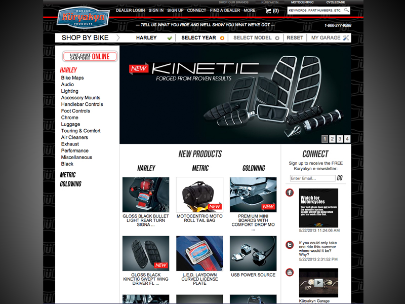
The most difficult aspects of this entire redesign was to figure out a way to present hundreds of products that are able to fit on so many different bikes, and to make sure that a customer was still able to choose their own bike with products displayed to the specific bike(s) they may have. Our solution was to present all three main bike categories – Harley, Gold Wing, and Japanese models such as Yamaha and Suzuki – and display the latest or most popular products. Though this may or may not be the exact fit for the customer’s ride, the customer was able to create a custom “garage” to specify their bike which would then display the correct parts for the specified make, model, and year of the bike chosen.
To ensure that each customer did not have to go through the same process over and over upon returning, we gave each customer a unique code which had all the information necessary to re-display their chosen information if they had returned to the site; the customer did not need to create a garage to have the tag added to their history/cookies. Upon arrival back to the website, all information would be displayed for the selected make and model previously chosen. This proved to be extremely effective in all aspects; fewer bounces, 40% less abandoned carts, and an increase in customer website accounts.
As being in charge of the UX and UI, I wanted to make sure that customers were provided a quality experience that would also show as much product as possible. Customers had to be lead to the products, but still needed to be able to access their garage and personal information readily. Top and side toolbars were the solution since the main body of the page was to be strictly used for product.
Overall this was a fun challenge that had many different ideas floating about, all trying to figure out the best way to both create more income and to push a style that the company is known for.

Leave a comment