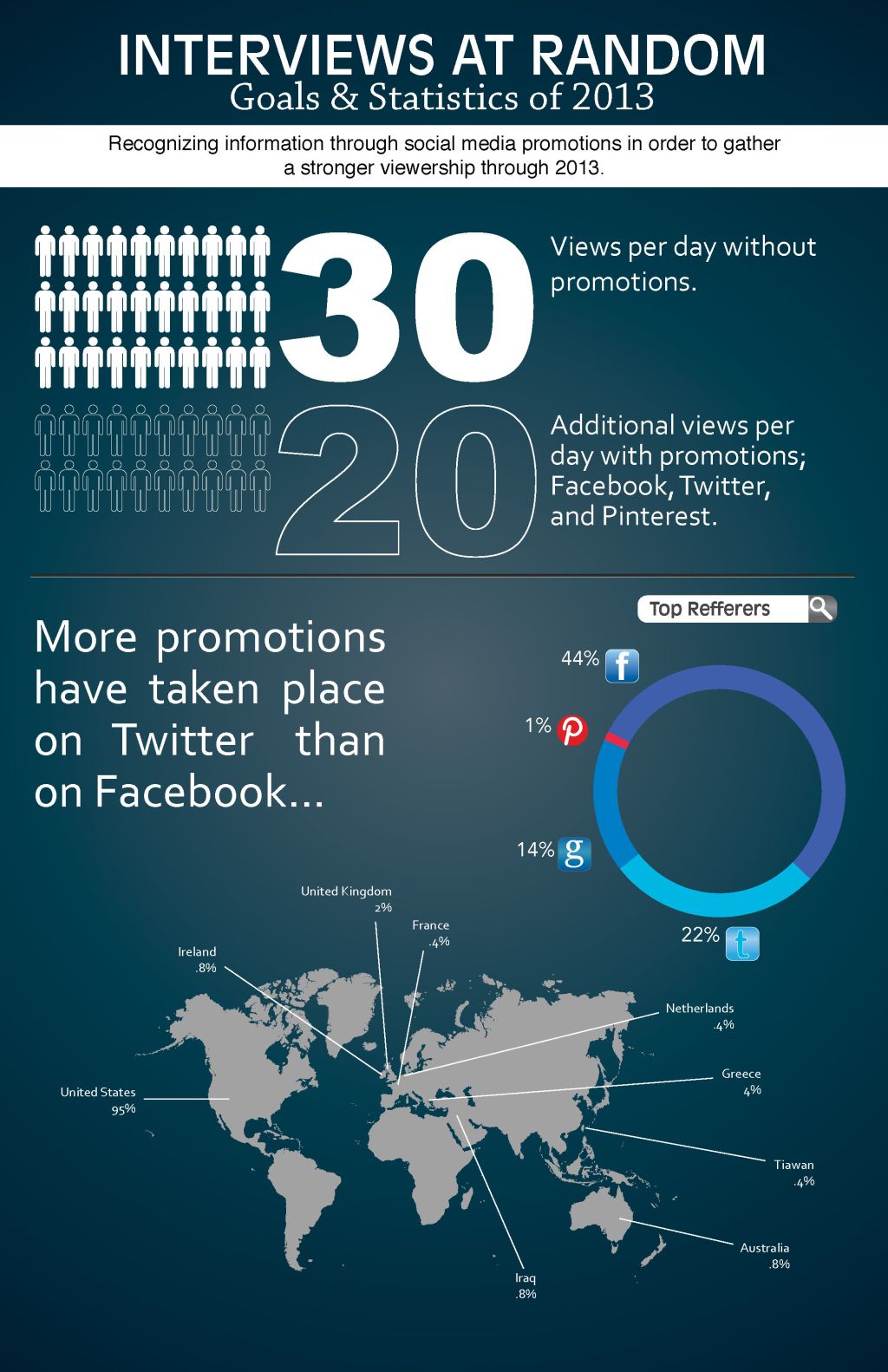
This infographic was based off of my current statistics to Interviews at Random (dot com). Though I wish I could have had some greater depth to the information from programs such as Google Analytics, I still think it was nice to put things into a visual perspective. What’s most amazing for me is the fact that even though I have read the information, it still doesn’t make as much of an impact as building the graphics to actually see the information presented. Again, it’s not a whole lot of information to read, but it certainly will be a template for further comparison.
Overall I really enjoyed this personal project and will be looking into doing more infographics like these soon.

Leave a comment